- Discipline
- Branding
- Digital
- Marketing
- Out of the ordinary
- Sector
- Charity
- Corporate
- Cultural
- Education
- Retail
- Small business
Work Shell brand and communications

Working with a global brand to produce new brand support and marketing communications
In 2007 we were chosen to join Shell's roster of design agencies and produced a range of work over a number of years including brand creation, campaign concepts, communications design and master brand guideline design.

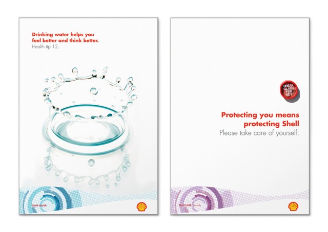
HSSE brand identity creation
Shell Health, Safety, Security and Environment (HSSE) is an essential function of the Shell business. In order to unite the various messages and sections of the function which had recently been reorganised, it required a strong brand graphic. The creative solution is a ‘full circle’ graphic representing the on-going monitoring and reviewing that enables Shell to achieve a Goal Zero of accidents or incidents. The graphic is then coloured individually for each discipline – Safety, Security, Environment and Shell Health.

The brand also includes circular imagery, which can be applied in any new campaign or publication making it adaptable to the variety of messages required now and in the future.

Volunteer initiative campaign
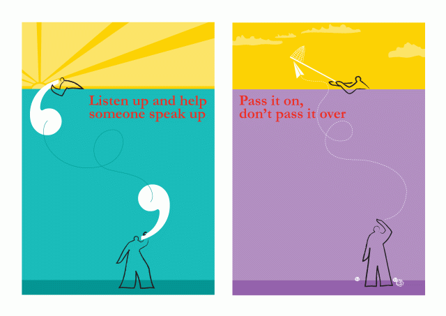
Shell has a strong volunteer initiative which supports the development of both the employee and the public. They had recognised that it is a challenge to motivate staff each year to donate their time to this initiative. They tasked us with the need to create something distinctive and original for 2008’s programme.

We created a distinctive and visually entertaining set of nine illustrations which are used across banners, posters and leaflets to represent the name of the initiative – Hand in Hand.

By using illustrations we were able to appeal to all groups whilst retaining a human element to the campaign.

Strong copywriting worked with the illustrations.
Shell Foundation brochure
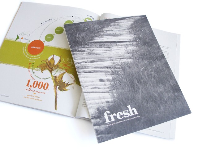
Shell Foundation was set up in order to facilitate partnerships for sustainable resourcing, linking supplier with retailer. Its first venture was to partner Marks & Spencer with cotton and flower suppliers. The success of this story is told in a showcase brochure, which in itself will help the Foundation find and create new partnerships. Using 100% recycled papers, rich photography and strong illustrations to explain complex trade diagrams, the aim was to achieve a coffee-table read with a strong message.


“When we decided that we needed to promote our success story of partnering Marks & Spencer with flower and cotton growers in South Africa and India, we knew it was important that the story appealed visually as well as strategically to a wide audience, from retailers, to NGOs for potential new partners. Fit Creative designed and produced a strong, distinctive style with rich photography, original illustrations to explain the complex organa-charts and beautiful production on 100% recycled paper stocks. The finished item certainly helped promote our cause. They were creative, professional and adaptable, working right through to delivering the finished printed items.”
Simon Bishop
Communications Advisor
Shell Foundation

Shell guidelines
The Shell guidelines need to be concise and clear on the policies for a very large business with many touch points. Working closely with the Shell team, we have created a reference document which will direct all the future business guidelines and be the cornerstone for development of the brand. Along with layout and design, we have worked on the copy writing and content.

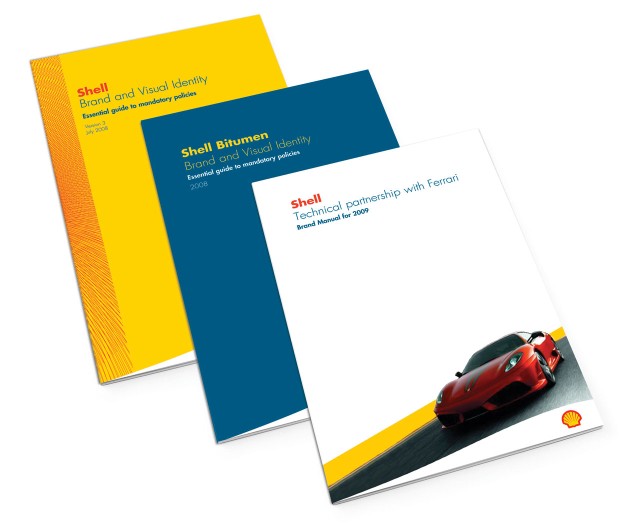
Following from the first guideline, we have created a number of policy documents including:
- Shell partnership with Ferrari – a technical partnership relationship
- Shell partnership with Ducati – a technical partnership relationship
- Shell Bitumen – a specific product business within Shell
- Shell Easy-surf – an internal micro site providing a quick guide to all the policies for Shell’s retail offer

GTL product sales brochure
A bespoke brochure created to promote Shell GTL Normal Paraffin to a B2B market through its perfomance statistics.
The brochure was created with specialists papers, printed in specials and metallics and finished with Singer sewn binding.

The text is set with a restrained look and feel and a grid printed across the page appears to ripple at various points.

Shell Norway calendar promotion.


