


South East Enterprise
Providing design and marketing for an established business services organisation in South East London.
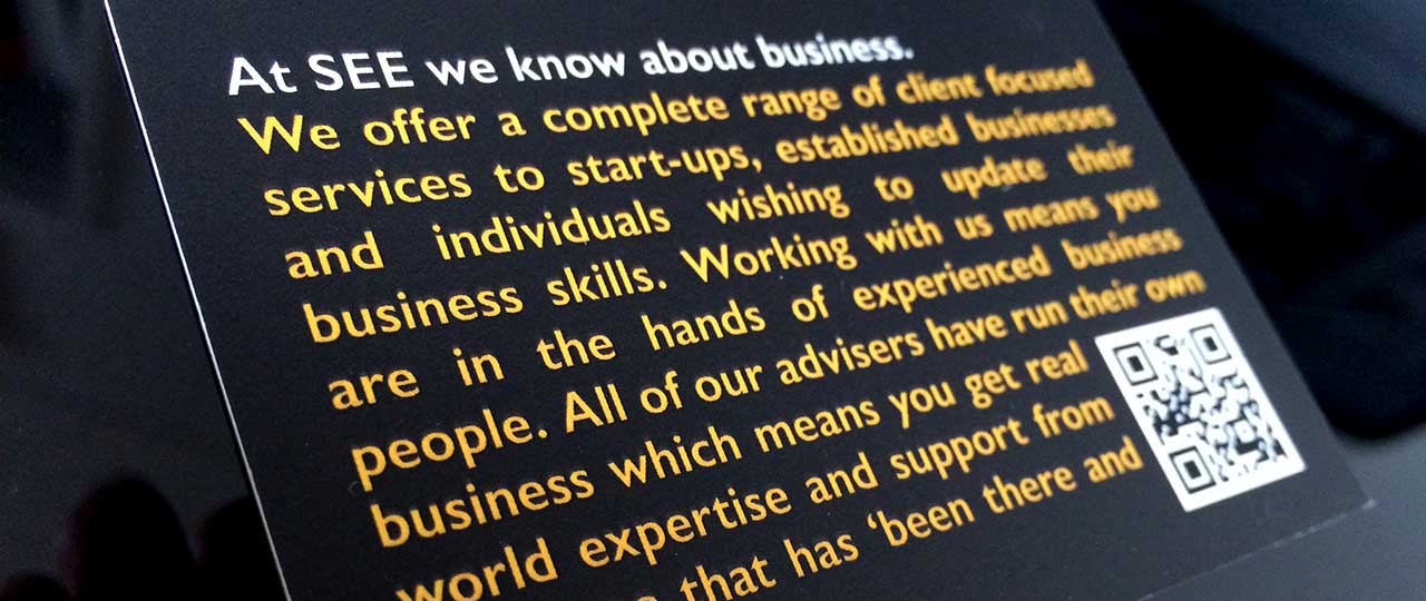
South East Enterprise (SEE) provides business enterprise support services directly to businesses and through funded local government programmes. It is a well-established business with a strong reputation. We began working with the CEO, Tony Goldstein, providing design services for a short business programme. Over many years of a close business relationship, we developed the SEE brand, its website, and their longest-running initiative, the e-business programme.
- Sectors and services
- Education
- Brand presence
- Digital + Film
Brand development
We have worked with the client to ensure that its brand look and feel is contemporary and distinctive and the messaging is compelling. And we supported with design and production of key business tools to ensure the brand was consistent across all its comms.
“It’s always a pleasure working with the team at Fit, and developing a new range of marketing materials for our new company services and courses has been no exception; building seamlessly on the brand image they created for us. The icing on the cake has to be the redesign of our website, which is now fully content-managed, an absolute boon for a company such as ours. The development process was made easy by Fit, and the finished product is proof that they interpreted our requirements exactly. An online booking facility, as well as full integration with all of the popular social media platforms, has helped prepare us to move SEE to the next phase of development.”
Tony Goldstein
Managing Director
South East Enterprise
Website
We have designed and built the client website to be responsive across all platforms, with full CMS control. The website's look and feel leverages on the brand language we have developed.
Business Growth Programme
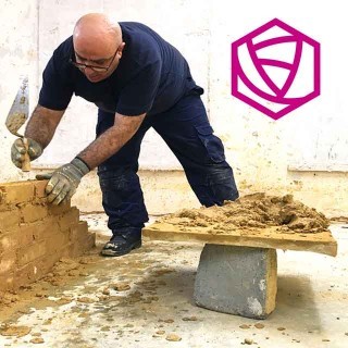
An enterprise programme aimed at new start-ups. We provided design for marketing and training tools.
School Gates Programme
A business and enterprise programme aimed at young parents fitting their work around the school timetable. We provided design for marketing and training tools.
e-business Programme
The longest-running programme focused on developing valuable e-business skills and assets for businesses within the Royal Borough of Greenwich. The programme has been through two different iterations and has been hugely successful. We provided design for advertising, print marketing, digital marketing, and exhibition panels.


School Gates Programme

The Growth Programme

The E-Business Programme