- Discipline
- Branding
- Digital
- Marketing
- Out of the ordinary
- Sector
- Charity
- Corporate
- Cultural
- Education
- Retail
- Small business
Work Greenwich Market branding

Developing the Greenwich Market brand over a number of years
We have been very fortunate to be able to support Greenwich Market as their brand positioning has developed into a distinct offer of a designer makers market. During our relationship with them we have run two consecutive brand developments.

I Love Greenwich Market
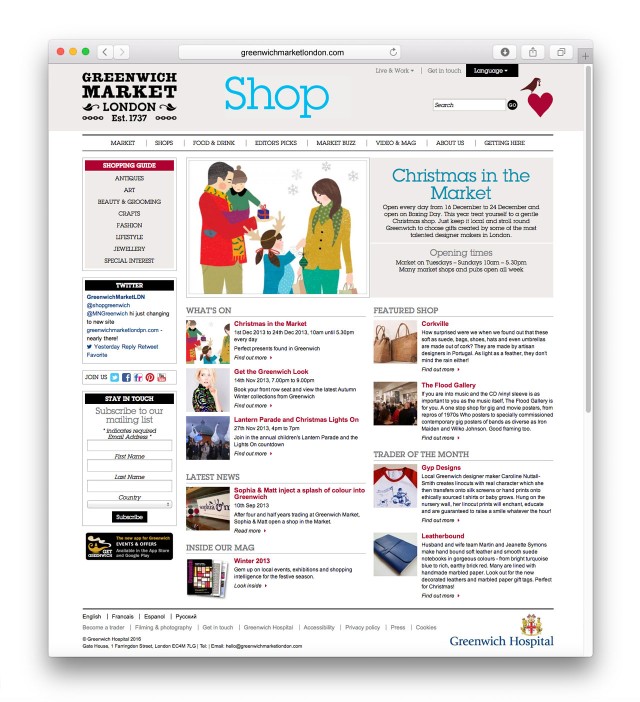
When Greenwich Hospital Estate regained direct management of Greenwich Market, they identified that there was a need to promote it as a retail destination of choice and establish more clearly the unique arts and crafts offering to local, regional and national audiences.
We worked quickly to create a distinct campaign mark – I Love Greenwich Market – and launch it in time for Valentine’s Day.
The brand was developed to have a set of ten different coloured marks and over 30 different icons to represent the different types of products and events in the Market. Solid guidelines around the mark and icon lockup usage ensured that this flexible brand was not abused and that recognition from the public was achieved whilst still keeping the offer fresh.
The brand language and image library have been built up in a short period of time in order to capitalize on the regular events held in the market and promote these through quality door drops in the local area. Supporting advertising in regional and national press is helping raise the profile of the market.
Clever use of materials, budget and time has meant that a very cost effective brand has been implemented and is proving its worth in the positive feedback from public and tenants alike as Greenwich Market moves into a more distinct position amongst London’s other market places.

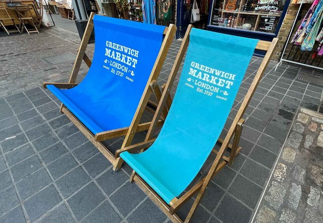
Est. 1737
Having run the I Love Greenwich Market campaign for 4 years it was time to refresh the Market brand and leverage it's long history and standing in amongst London's markets. The new mark is a more classic look whilst retaining the unique quirkyness of the site. Within the new classic mark the chains hark back to the naval history and the leaves celebrate the greenness of Greenwich and it surroundings. The addition of London allows the brand to engage more with the millions of foreign visitors who make London their holiday destination yearly.
Following the creation of the new logo, a responsive website was created with supporting illustrative style.


Also for this client
Marketing

Marketing

Marketing

Digital


